Il progetto.
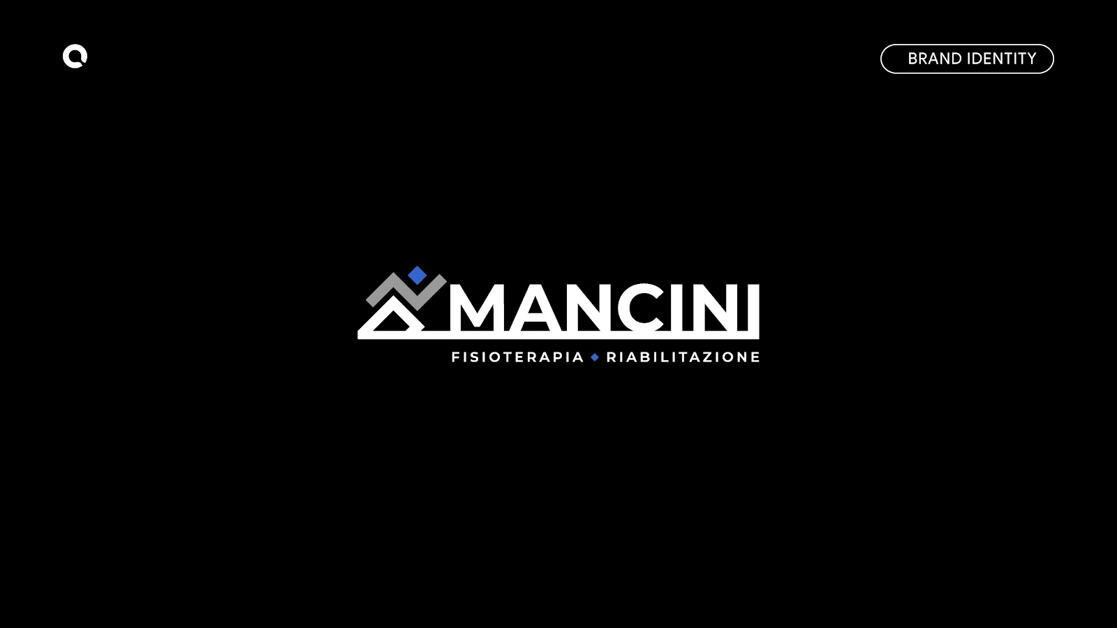
Elegance, simplicity, and professionalism: these are the distinctive traits of the new logo designed for Mancini.
The brand stands out for its versatility and for its unconventional symbolism, far from stereotypes, which makes it unique and recognizable.
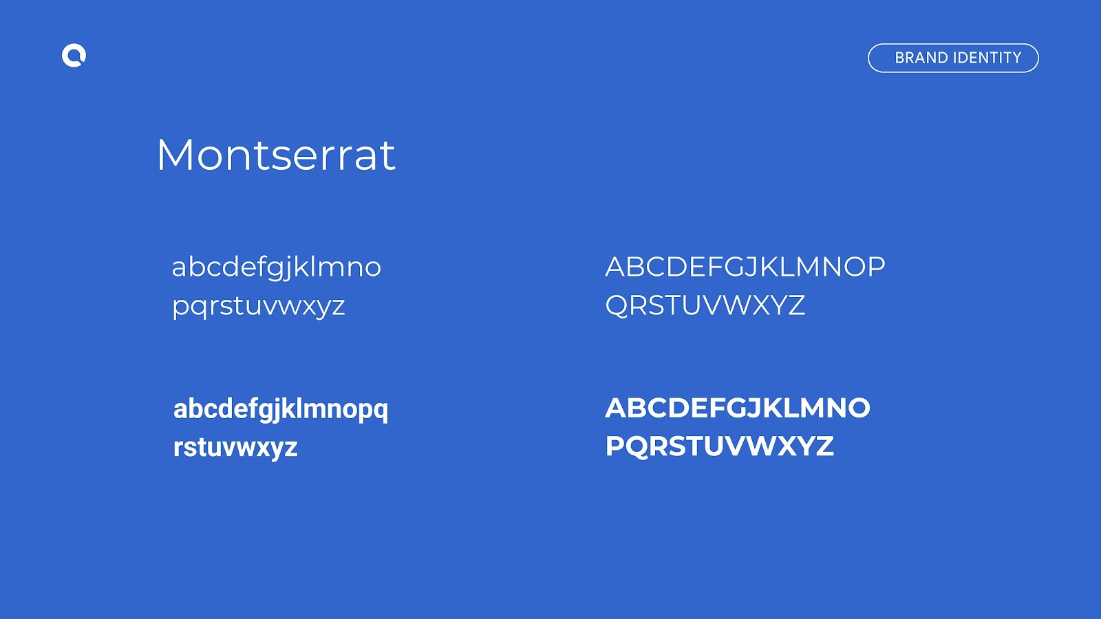
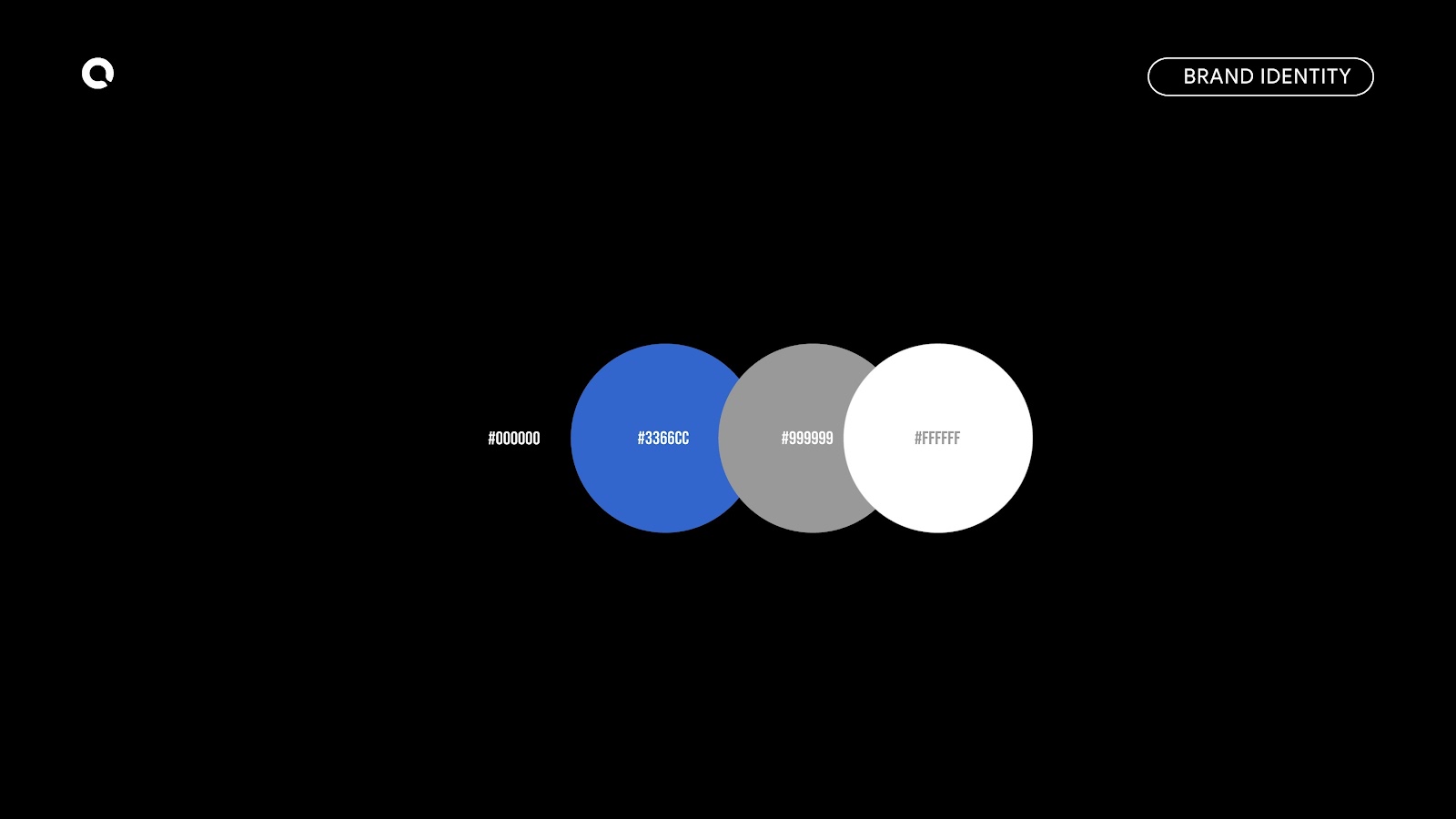
The style is modern, fresh, and impactful, with a strong and coherent visual identity. The design focuses on formal cleanliness that enhances readability, allowing the logo to adapt effectively to any type of application and medium.
A defining element is the use of typography: not just a support for the name, but a true decorative element that interacts with the symbol in a harmonious and original way.
The iconic mark is inspired by the shape of the human body, evoking the dynamism of the Futurist sculpture Unique Forms of Continuity in Space by Umberto Boccioni. An artistic reference that gives depth and meaning to the project while maintaining a contemporary visual language.